Showing posts with label Ancillary Texts. Show all posts

Thursday, 18 December 2014

Poster & Digipak in use

This is what my poster was originally going to look like prior to increasing the synergy between this and my digipak, The poster's effective as the important information such as band name and album title will be in line with the eyesight of passers by; therefore, this makes it a good way of advertising as it has the potential to be seen by a large audience each day.

Here is the what the digipak would look like in use on iTunes. The digipak would be under new releases as well as being in the rock genre category of iTunes. Being in the new releases category is important as it's at the top of the page and so people will be more likely to see it, also by being on iTunes it has the possibility if being seen by millions of people each day.

Saturday, 13 December 2014

Finished Poster and Analysis

I decided to keep my poster quite simple as I didn't want to overwhelm the audience; This being due to the fact that my primary research showed that they were more favourable towards a clearer text rather than an overcrowded text.

 I believe that it was important to use a picture of the lead singer on the poster due to the fact that he would be at the front of the band and so would be the most recognisable, this would mean that without reading the text audiences would still know what band was being advertised. As well as this, using the lead singer leads to the opportunity of Uses & Gratifications theory as audiences would be able to build personal relationships, or identify with, the lead vocalist as it's a more personal shot than which you would see in the performance shots of the music video.

Also, I thought that it was vitally important to put that it was the bands debut album as well as the release date of the album due to the fact that other possible audiences may try listening to the band due to the fact that they hadn't previously heard of them. Furthermore, if audiences frequently see the poster, then the release date will be stuck in their head meaning they will be more likely to think of the date as an important one, as they have been frequently reminded of it. 

I've continued with the cosmic space theme on the poster, I have subtly included a black and dark blue vignette over the edges which will connote the feeling of the night sky. This builds iconography through the bands digipak and poster and therefore will increase the recognizability of the band in the eyes of the audience. This effect is further build upon by the use of a cosmic sky faded over the central image, the conflicting colours reflects many aspects of the genre as it shows both the red (connoting anger) and light blue (connoting happiness) fighting against each other which represents many songs of the genre.

Thursday, 11 December 2014

Finished Digipak and Analysis

I have chosen these specific logo's backgrounds and pictures as I believe they best represent the story of our music video and also the personality of our band. For the bands name we chose 'AlienNation' as it's a take on the word 'alienation' and so creates the same meaning and feelings as the word its derived from. We chose this due to the fact that we wanted to connote that many of our target audience may have at some point felt alienated, however by changing the word to 'AlienNation' makes the band seem unique and unpredictable due to their views being represented as 'alien', when opposed to everyone else's. 

We chose the album title 'Beyond Earth' in order to stick to the alien theme as well as choosing cosmic backgrounds for a few slides of the digipak. The cosmic backgrounds used are dark, which signifies the negative emotions of the genre, but furthermore, the stars represent lights in the darkness which would represent the more uplifting side to the genre. The font used for the album title is quite scratchy and untidy, I chose to do this as many of the target audience will be into the grittier side of the rock/metal genre. 

Due to the fact that the album would, as you'd expect from the genre, feature songs with strong themes/language, I felt it was necessary to include a parental advisory sticker on the front of the album cover. Recognizing that audiences may already be a fan of the song 'How you remind me', I decided to put that the album featured our cover of the track on the front cover in order to gain the interest of audiences of the bands music video, as well as audiences of Nickelback themselves. I included this as audiences of Nickelback may want to here the bands take on the song/video. 

I chose to have a picture of the band performing as, during my research, I found that this was a recurring theme from digipak's and therefore, I decided to conform to the genre, making sure that I chose a image which represented all members of the band. By denoting more members of the band there is a greater chance of the audience forming a personal relationship with one or more of the members. Furthermore, I decided to add the picture of the female protagonist from our music video walking away from the male character, by doing this I create the enigma theory as audiences who haven't already seen the music video will wonder, firstly who the characters are, and secondly why the female is walking away from the man. An audiences who have seen the video will identify the image and so possibly desire to buy the digipak in order to hear the rest of the bands music.

Wednesday, 10 December 2014

Digipak Pictures Editing


 For the picture of the two band members against the wall i had to firstly paste 2 separate pictures over eachother in order to make it look like 1 picture, while doing this i had to edit the fencing in the background to make the 2 pictures look more like a single one. Furthermore i added a greyscale filter and also increased the contrast 17% as well as increasing the game by 0.70


 For the performance shots i added a greyscale filter and also further toned down the overall colouring in order to look the same shades as the other picture of the band members.

 
For the track list i used an Alien League font and increased the overall brightness, contrast and game in order to make it share the same colours and shades as the front cover.


Sunday, 7 December 2014

Digipak Template

Template for the inside of a 6 panel digipak

Template for a 6 panel digipak flatplan


Inside of a 6 panel digipak template 3d


I have chosen to do a 6 panel digipak due to the fact that it allows me to present more imagery and pictures of the band to the audience. As well as this by using a 6 panel digipak I can present more information to the audience without making each panel too overwhelming, also it makes audiences more likely to purchase my product, as they will feel more satisfied that they are getting more for their purchase. The digipak is a much more modern alternative to a CD and this is another reason which will influence audiences to become more likely to purchase the product. 

I was also influenced on this decision through my research into Metallica and Stone Sour's digipaks. Having purchased both digipaks myself I believed they were much more beneficial to an audience member. The digipak for 'St.Anger' by Metallica denotes to me the important role a digipak can have in creating iconography for a band. Upon release the band were soon associated with the image of the red-bandaged fist. I wanted my product to have the same effect in order to make the band more recognizable. 'Audio Secrecy' by Stone Sour has influenced my decision to include an image of the band that isn't just a performance shot, after viewing the image of the band in the digipak audiences will feel like they have formed a more personal relationship with the members due to the fact that they have seen them on a more common ground rather than just constantly seeing them on stage or in other performance shots. 

By having a digipak, i'm conforming to the direction which the genre is taking as, in today's music market, it's becoming increasingly popular for rock/metal bands to release digipaks. New releases such as the digipak for Slipknot's "The Gray Chapter" remained on top of Play.com's 'top new releases' category, ranking higher than the regular CD case. Too add to this, I believe that in a time when it's so easy to just download an album from iTunes, artists need to give audiences a reason to buy the album in a hardware format, and as a result I feel that a digipak is key in order to maximize the possible target audience.


Digipak Flat Plan

After researching similar digipaks of the rock genre my digipak will include...
A title panel (Front cover).
A tracklist panel.
A CD panel.
A panel with a narrative picture from our music video.
A panel with a performance shot of the band.
A panel with an image of the band members.

I have chosen to change my front cover from my initial idea of having a brick wall background, to having a cosmic star background due to the fact that a more cosmic background will link better with the bands name 'Aliennation' and, the album title 'Beyond Earth'.I will also use the cosmic theme on the back panel of the digipak making it a recurring theme throughout various panels. As well as this I have decided to use self promotion by saying that the album features the hit single 'How you remind me', the song which we based our music video around. For the album title I will use the 'oh no' font and for the message which says 'featuring-how you remind me' I will use the more simplistic 'Impact' font, a decision made as a result of audience feedback. For the band's logo I will use the 'True Lies' font.

On the track list panel I will use guitar strings in order to underline each of the song tracks. This connotes the use of a guitar in the recording studio which is more personal as recordings are expected to be private to bands. For the writing of the tracks I will use the 'Alien League' font in order to keep with the cosmic theme and in order to build iconography for the band.

I decided to use the image of the female protagonist walking away from the man, as seen in my music video, as it will link my main production to my ancillary text. Also it will sum up the album as it connotes the depiction of breakups, but also the effects of people walking away from their problems.
Furthermore, i'll include an image of the band members in a more private shot which will allow audiences to have a better chance of building personal relationships or identifying with the band as they will see them outside of their performing environment, in which, audiences may not usually be able to relate to. Finally, i'm going to include a performance shot taken from the music video in order to encapsulate the bands emotions whilst they are performing as my questionnaire suggested that audiences wish to see the band performing throughout music videos and other formats.

Thursday, 4 December 2014

Analysis of Stone Sour's Audio Secrecy Digipak


Outside Back Cover
Outside Front Cover
Outside Open Panel


Inside Bonus CD Panel (Right)


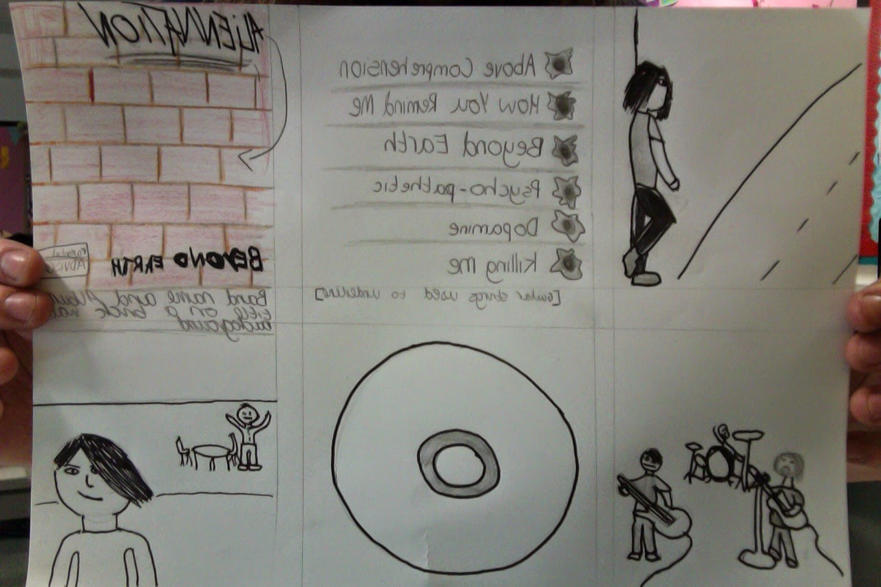
Inside Booklet (Central)
Inside CD (Left)


Stone Sour's 3rd studio album 'Audio Secrecy' was released in 2010 and saw mass sales across target audiences similar to my own. The entire digipak has been made to look like crumpled pieces of paper with very detailed ink sketches on them. The ink look along with the crumpled paper makes the album look very vintage, the same is connoted by many of the furnishings which are depicted around the cover. 

The front cover, when deconstructed is very basic, which as my questionnaire states, is a desire of my target audience. You have the bands signature logo of the two back to back S's central to the cover. Above and below this is the bands logo with the stereotypical typography that has been used with for over a decade. Below it, is the album title, in each of the 4 corners there is an ear depicted in what looks similar to a seal of approval. I believe that this is a connotation intended by the band in order to indicate to the audience that when they hear the album they will approve of it.

The back Cover has the track-list in what appears to be a mirror. The text also promotes the fact that the digipak comes with multiple bonus' for the buyer. In the left corner there is information about the band and record labels website as well as necessary trademarks. On the other outside panel there is a picture of the band and as you would expect the only 2 members who are looking at the camera are Corey Taylor and Roy Mayorga. This would be expected as these two are already known worldwide from the inter textual reference of them being in the band Slipknot. This relates to Blumler & Katz' audience relation as they will previously know the individuals from a more popular band and so audience will buy the digipak as they already know what to expect from their music. 

The inside CD is very much a replication of the front cover but this time it is predominantly in white.The CD features the bands logo as well as the signature back to back S's icon that is associated with them. The bonus CD which offers a video of a few live songs performed during one of the bands shows, as well as a mini-documentary of how the album was recorded, this is a direct contrast to the regular CD as it is much more simplistic, mainly black and the logo is on a much smaller scale and this time the name of the album is at the top of the disc,

The final panel in the Stone Sour 'Audio Secrecy' digipak is the booklet panel. When opening the digipak, the most central thing audiences will see is the booklet, alongside this is a leaflet which offers you free content if you go to the bands website, which for some, may be an added incentive to buy the digipak instead of a downloadable copy or a CD. The booklet continues with the theme of dull colors following the theme of the digipak. Although, the booklet is very detailed with information such as lyrics for all 17 songs (Including the 3 bonus tracks only available with the digipak), credits, who the band would like to thank, how venues could book the band, how the band can be contacted, their record label, images and much more.

Wednesday, 3 December 2014

Analysis of Metallica's St. Anger Digipak


When researching digipaks of the rock genre I started by looking at Metallica's 'St.Anger'. As you can see the Digipak for Metallica's 2003 album, 'St. Anger', is extremely detailed with typography, imagery, graphics as well as other added extras.

 Surprisingly the bands logo, nor the album title itself has been indicated on the front cover. However the famous metal band did use the iconography of the fist bound by rope in order to indicate that it's their album. The fist connotes anger and the ropes connote restraint. This feeling of anger is represented throughout the entire album itself. 'St.Anger' was recorded at a time when the band were trying to break from the restraints of their previous albums and experiment with different musical styles.

 The colors on the outside cover are a binary opposition to the inside covers as they are extremely bright and eye catching to obtain peoples attention; whereas the inside cover is much darker and features much duller colors to represent the traditional themes of the genre.

As it's clear to see every side of the digipak has been used for its own individual purpose. On the 3 outside panels there is the eye catching album cover itself, the 11 song track-list, and artwork related to the front cover of the album. The artwork denotes the face of which the iconic fist on the front cover belongs too and over the 11 years since the album's release, this image of the red zombie has gone on to become a graphic which is greatly related to Metallica.

On the inside panels there is a sleeve for the extremely detailed booklet which features information on the band, credits, lyrics, photos and more. The central panel, conforming to the traditional layout of a digipak, is the 'St. Anger' record itself, and below that there is the bands logo and the albums name. On the final panel there is a bonus CD featuring rehearsals for the album, entitled "St. Anger Rehearsals".  The CD itself replicates the front cover as it has the same image of the bound fist but on the CD it is in a much slicker looking black and white rather than the overload of color on the front cover.

The use of typography of the album title has been replicated around the digipak on the CD and also the bonus CD. The band have been known to often have new typography for each album which again is a cliche of Metallica.

Saturday, 29 November 2014

Differences of a CD Case and a Digipak

Digipak


My group will be designing a Digipak in order to promote our music video. Digipak's are made mainly out of cardboard, but the disc tray itself is made from plastic. There are several strengths and weaknesses of using a digipak. A strength  is that unlike CD cases, they are made to unfold revealing an extra inside sleeve, in which we can insert further information or graphics we wish to associate with our band/music video, to further promote ourselves to audiences. A weakness, however, is that Digipak's are often criticized as they can't take as much wear and tear as CD cases and so ,for collectors, they are often unpopular. A final weakness is that with proliferation of hardware and content it is now easier for people to download music instead of purchasing it in stores and so a digipak may be more undesirable.

CD Case

CD cases are much more traditional than a Digipak. They're made completely from plastic and as a result are stronger than a Digipak. However, they are much less beneficial when it comes to quality of information as you often don't have a separate pullout booklet with a CD case. Instead, any additional information is often printed onto the reverse side of the front/back cover. This is a weakness due to the fact that audiences usually wont be able to view this side until they've already bought the CD and so, by this time, using the side for promotional purposes isn't necessary. As well as Digipaks CD's also face the problem that downloads from sites such as iTunes are becoming more preferable and so our audience will be instantly narrowed no matter which form of casing we choose.

I believe a Digipak is better because...

When comparing the benefits of a Digipak/CD case, I believe that a digipak is greatly better for self promotion. Adding to this, buyers/hardcore music fans are likely to want to collect band material/special edition digipaks/cases or other merchandise. As a result, digipaks become more desirable to the target audiences than CD cases. Furthermore, I believe our audience wouldn't be very traditional, as denoted by the survey responses which show that the target audience is made from young adults who enjoy newer rock/metal music; this means they wouldn't be into the traditional values of a normal CD case. Finally a Digipak allows us to include far more information about our band and our music video than a CD case would as it allows us to include artwork, lyrics. a track list, credits, information about the band and much more. All this will make it far more presentable to audiences, who, as a result will be more satisfied with their purchases and in the long term lead to them wanting to purchase the bands future work, as well as suggesting to others that they should also buy the product.

Thursday, 27 November 2014

Deconstruction of a tour poster - Linkin Park

                                                                                                                                                                                                                                 
 The 2014 tour poster for Linkin Park's 'The hunting party tour' is very different to the previously analysed Slipknot tour poster. This poster is a lot more brighter and eye catching to the audience even though it is only in black and white. The main image on the poster is off of the bands 2014 album 'The Hunting Party'.

 The most central item on the poster is the bands name along with the supporting band's name 'Of Mice & Men'. Unlike on the Slipknot poster the band's do not use their usual typography and instead the poster carries very little on which audiences can recognise the bands by other than their names. For this reason the poster looks very basic and i believe that it would be the opposite for this poster due to the fact that this is not just for a UK tour but for a European tour and so in my opinion the bands should want to make their logo's much bigger and use as much iconography and typography as they can in order to be recognisable to an audience of different languages and cultures.

Furthermore due to the scale of the tour, the Linkin Park poster ,juxtaposed to the Slipknot poster, isn't able to give as much detail about individual venues, resulting from it being a European tour poster. This makes the poster less informative and so it may be less likely to grip a passive audience as they aren't being fed all the necessary information that they may personally require.

In terms of self promotion both of the bands have their logo's and the album covers of their new albums on the bottom of the poster stating that both albums are 'out now'. This is similar to the Slipknot poster however you can see that on this poster both of the bands are being promoted rather than just the headlining band. This may suggest that there is a positive relationship between the two bands and so they would like to help promote each other as much as possible. The final piece of promotion is the link to both of the bands websites in very small text at the bottom of the poster.

Finally, unlike on the Slipknot poster there is no unrequired information such as who is presenting the tour of the two bands and who has booked them. This will make the poster easier to digest for audiences as they wont have to scan through as much unnecessary information.

Wednesday, 26 November 2014

Deconstruction of a tour poster - Slipknot

The UK tour poster for Slipknot's 2008 'All Hope Is Gone' world tour isn't too much different to their album which shares the same title.

The main image is shared with the album of the band being stood in the field in their easily identifiable costumes, which they have became famous for. The bands logo is what stands out the most on the poster and will be what attracts their audiences to the otherwise dull coloured poster as they will see the specific typography and instantly know the band that it represents. As well as this there is the iconography of the 9-pointed star (the 9 points represent each of the bands 9 members) faded across the entire poster. This star is used continually by the band and so will be easily recognisable to any member of the bands target audience.

The main aim of this poster is clearly, to sell tickets and the designer of the poster has done this by providing as much information, about where the band will be playing and where to get tickets from. Adding to this the placement of text is key to selling tickets exemplified by using half the poster to denote UK tour dates, their venues and a phone number for contacting each specific venue. Furthermore, at the bottom of the poster there is information of websites which distribute tickets Feeding audiences with this crucial information led to the majority of venues selling out of tickets.

Finally there is the aspect of self-promotion of the poster, the largest piece of visual text is the headlining band, Slipknot's own logo. The use of a brighter colour helps to highly contrast the dark, stereotypical, rock genre background; whereas the supporting artists 'Machine Head' and 'Children of Bodom' have their logo's paced in a smaller size which helps to further make the headlining band, Slipknot's logo, stand out. . Slipknot have further promoted themselves at the bottom of the poster by using white text stating that their new album is now available to buy which is informative to audiences as it will remind them to purchase the album whether or not they by tickets to the tour, making the poster successful in more ways than one.

All of these aspects of the poster make it very informative to the audience of slipknot and provide them with all the knowledge they need to know about where and when they can see the band perform. The less needed knowledge of who has presented the tour and who the booking agency for the band are is in a much smaller font at the top of the poster with their logo's in the top corners; this is information that you would expect to be disregarded by the audience.